Remember the natty idea to take photographs representing a year of working in public health research? Well, how about a quick analysis of what we saw, snapped and submitted? Here are the exciting and indeed revealing results.
After looking at 198, or was it 200, images a portrait of researchers concerns emerges – not exactly Maslow’s hierarchy of needs, so much as the Rhodes' hierarchy of academic obsessions.
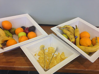
Bottom or is it top of the pile comes food. It’s official – no less than 42 pictures, close up and distance shots, ranging from individual snacks, drinks and meals to full size conference spreads and displays. I felt slightly queasy after looking at them all. Feed those academics!
The next most important thing is to feed the mind. Any passing course, lecture, symposium and the like weighing in with 20 pictures. But there’s lots more that get close to the mind-feeding category although making more cameo-esque appearances, such as degree ceremonies, IT, stands and posters, books, theses, work in progress and journal covers. Publication definitely counts. Completing work even more.
The office – no not the TV series, comes next, with 16 images, inflated perhaps with opportunities created by moving office and the delights of standing desks and desks tied to exercise apparatus. I would not have dreamed that taking a picture of the immediate work environment was so important.
Travel ranks highly but possible to count in different ways. Railway stations are significant at 11 pictures, especially Newcastle Central – of world significance as stations go, but that’s just me. Car travel featured just slightly with a nod to cycling. Active travel (good and bad) is clearly a source both of delight, when stairs get favoured, and frustration, when lifts are promoted. Exercise equipment got a decent look in too.
Signs and marketing really played on the collective academic mind. Labelling, the impact of shop placements and advertising, spelling mistakes, unintended humour, public health messaging, came in with around 12 images. Some of this felt a bit judgemental, when it came to cheap unhealthy food signs. Not too many wider determinants of health, it has to be said.
Culture kept creeping in. Museum visits, architecture, music, sculpture were all there. Nature played a relatively small part, but researchers did appreciate the cute, the beautiful, office plants and the changing seasons.
Then a whole rag bag of one-offs. Some were clearly novelty items or personal reminiscences, and some seemed like stream of consciousness, or pet concerns.
Curiously, the academic world was quite short of pictures of people, except in crowd shots doing serious lecture type stuff. It looked a camera shy world. So what do we have? A hard working, semi-office bound, nomadic community that likes writing, learning, unable to switch off form public health even when undertaking a leisure activity or just walking around the town, that enjoys high art and longs to sniff a flower. Is this what we are? The camera apparently doesn’t lie.


No comments:
Post a Comment