Posted by Mark Welford, Fuse Communications Manager, Teesside University

Around this time of year I do a similar (if slightly less garish) job of pulling together the top 5 Fuse blog posts from the previous year.
But this year is a little different.
It’s award season and this year the blogs listed below were in the running for a coveted gong. Not at the GRAMMYs, Oscars, Emmys, BAFTAs, or BRITs but the (much more prestigious) first ever Fuse Awards!
Earlier this week (30 January), the post with the most views was crowned best blog of 2022 with the author awarded a shiny trophy at our ceremony in Durham *link may contain SPOILERS*.
So without further ado, here is the full list of the runners and writers in reverse order, culminating with the post that received the most views...

“...primarily designing around the needs of the private car - rather than humans - has been a disaster.”
Prof Townshend explores how we can plan for a healthier future by intervening in the built environment. From the 'toxic high street', to the green (and blue) spaces in our cities that encourage physical activity and social interaction, positive for physical health and mental wellbeing.
Posted: 13 May 2022
Posted: 13 May 2022
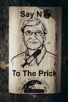
Posted by Louis Goffe, Research Associate, NIHR Policy Research Unit in Behavioural Science
"...building the evidence-base isn’t enough, we all need to work on at least one aspect of the artistic craft of research promotion."
COVID19 has brought into sharp focus that health promotion takes more than good science, there is an art to the delivery. In this post, Louis explores vaccine misinformation, the infodemic, involving the public and advocacy.
Posted: 28 January 2022
3. What support do children and young people actually want when their parents use drugs and alcohol?
Posted by Cassey Muir, Fuse & NIHR School for Public health Research (SPHR) funded PhD Researcher from Newcastle University and Kira Terry, Lived Experience Expert.
Posted by Cassey Muir, Fuse & NIHR School for Public health Research (SPHR) funded PhD Researcher from Newcastle University and Kira Terry, Lived Experience Expert.
 “No-one has ever asked me about how I feel in any of this.”
Fuse PhD student Cassey shares her research aiming to understand the experiences, perceived impacts and coping strategies of young people whose parents use substances. The post ends with Kira’s thoughts about contributing to the project as a Lived Experience Research Advisor.
Posted: 9 December 2022
Posted: 9 December 2022
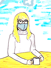
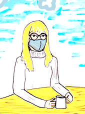
Posted by Emma Adams, NIHR ARC NENC Mental Health Fellow at Newcastle University, and Experts by Experience from Fulfilling Lives Newcastle Gateshead & #HealthNow Newcastle
Find out how Emma and her Experts by Experience worked together to develop striking visuals to share what they had learned from a study exploring access to community based mental health and substance use support during the COVID-19 pandemic for individuals experiencing homelessness and those providing support.
Posted: 25 March 2022
And in at number one our award winner...
1. Universal Credit experiences and research co-production

“In the past I'd always found the process of seeking
help from the unemployment benefit system to be
relatively easy, but Universal Credit was a disaster
for me.”
Ever wondered how you could help shape research as a member of the public? In this Fuse blog, David shares his personal experiences of claiming benefits and how this has informed research to assess the impact of Universal Credit.
Posted: 11 March 2022
Below is a photo of David (second from the right) along with the other Fuse Award winners. Congratulations to all!
Many thanks to everyone who joined us for the first ever Fuse Awards @durham_uni and a huge congratulations to our winners and those shortlisted! 🏆🎉🤩
— Fuse (@fuse_online) January 31, 2023
The standard of entries was exceptional and our panel of judges had tough decisions to make in all categories.#FuseAwards23 pic.twitter.com/uJimaKDzc7

Join Fuse to be in with a shout of winning a coveted Fuse Award in 2024!